Info text, warnings and unreconciled indicators
Subsection |
|---|
This documentation will be discontinued soon. As of the latest update on November 28, 2025, please refer to the updated guidelines for banners and icons.
Infotext
Infotext should be used to provide guidance to user:
- When used to provide a general information about the template, then info text sign should be fixed (not as hover) and should be aligned to the left side of the page.
- When only one template is related/linked to the current one, we should use a fixed infotext to display the link to related template (when more than one template needs to be linked, please refer to the section related to headers.
Example:

- In other cases infotext should be used as a hover, it should be on the right side of the text and contain a short description. Info text, when as hover, should always be accompanied with relevant text.
Example:

- Input fields should not be used inside an infotext.
Warnings
We recommend using warning texts to make clear to the user that an action could be needed, without having impact on the reconciliation of a template. A few clear examples:
- Guide the user to perform a certain action that cannot be automated (eg. add another reconciliation).

- Make the user aware of a certain check that has been done in the background (so other actions in the template can take note of it), without having any impact on the reconciliation of the template.

- To check if other details are missing (and it cannot be measured if this has to have an impact on the reconciliation or not of the template).

More examples can be found here as well.
Use of warning text vs. unreconciled indicatorIt should be noted that these are 2 different things, and cannot be used simultaneously:
- Warning texts can never impact the reconciliation of a template. Therefor, you can never let the warning text also function as being unreconciled.
- If there is something that does impact the reconciliation, it needs to be shown as an indicator. If extra information needs to be displayed onto why, don’t add a warning text to clarify. Make use of unreconciled_text instead.
Unreconciled indicator
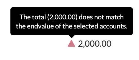
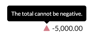
Unreconciled indicators either show off a green dot, or a red triangle (depending on its value). And they are a great way of showing to the user that a check is performed (which impact the reconciliation).
A few clear examples of when to use them:
- When a value doesn’t match another value.

- If the condition isn’t met (eg. the value needs to be positive, but is negative)

As seen, we always should use unreconciled_texts whenever indicators are shown. This makes clear for the user how the check is performed as well. If this isn’t done, the value of the 'unreconciliation' is just shown.
More detailed information about this subject can be found here.
Use of unreconciled indicator vs. mandatory fieldsYou could use indicators to make sure an input is made, but it’s should be noted that we have the required attribute for inputs (also called as 'mandatory fields') for this case.
The use of mandatory fields would lead to shorter code, and a more clear view for the user that the input needs to be done.
Like unreconciled indicators, the mandatory fields also impacts the reconciliation status of a template.

Updated 5 months ago
