Input fields
| Subsection |
|---|
| * General info |
| * Dropdown menus |
| * Boolean |
| * Date fields |
| * Account selector |
| * Attachments |
| * Placeholders |
| * Mandatory fields |
General info
- As a general rule, a question/statement should be on the left side of the page, while an answer/input field should be on the right side, if is not stated otherwise.
- An input field should not remain blank and should always have a placeholder to make sure that the user knows what kind of information should be provided. Please see the section “Placeholder” below for more information.

- When mandatory field is completed:
- make sure no warnings appear in the template; and
- remove any unreconciled indicators.
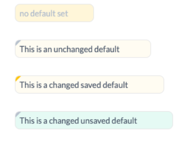
- In case a default text is used in an input field and it was not yet changed, the light grey mark will appear in the corner of an input field. This is done to inform the user that a default text was set. When the default text is changed the mark will become orange to alert user that there have been edits to the default text. To check whether the default version was updated or not, it is possible to click on the trash icon to restore the default text. Finally, if there is a green background to a text box, along with the mark in the left corner, it means the default text was changed, but it was not yet saved.
Below you can find the specific guidelines for the different types of input fields.
Dropdown menus
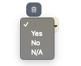
- Use dropdown menus when only one option is applicable or only one answer can be selected. (e.g. Yes, No, N/A).
- If the user has to select one of the options from a dropdown menu, you should make the dropdown menu mandatory by using the required attribute. Please see Input section for more information about the "Required attribute"
{% input custom.some.thing as:select options:"Yes|No|N/A" %}
Output
Boolean
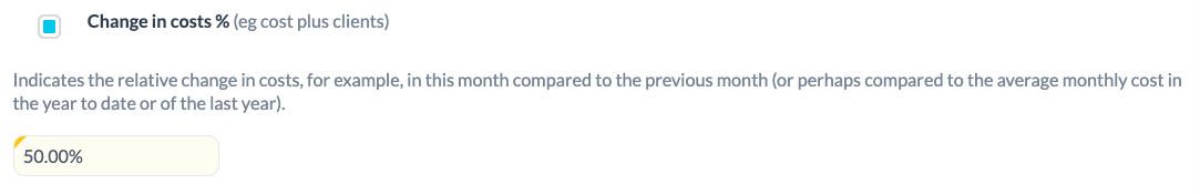
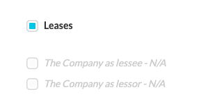
- Boolean should be used to select applicable option for the row in the table

- Boolean should be placed left to the main text it is related to. Such format will help to keep all booleans aligned and it will be easier for the user to notice the availability of the boolean that can be ticked or unticked.
- When boolean is selected, the header of the section should be printed in bold, unless is stated otherwise.
.png")
Booleans should be used:
- to show/ hide additional information to/from the template
{% input custom.change_costs.to_show as:boolean assign:change_costs_to_show %}{% if change_costs_to_show == true %}**Change in costs %** (eg cost plus clients){% else %}*<font color="CCCCCC">Change in costs % (eg cost plus clients) - N/A</font>*{% endif %}
  {% if change_costs_to_show %}
    Indicates the relative change in costs, for example, in this month compared to the previous month (or perhaps compared to the average monthly cost in the year to date or of the last year).<br>
    {% input custom.costs.change as:percentage %}
  {% endif %}
Output
- in cases when more than one option is applicable or more than one answer can be selected
{% input custom.leases.to_show as:boolean assign:leases_to_show %}{% if leases_to_show == true %}**Leases**{% else %}*<font color="CCCCCC">Leases - N/A</font>*{% endif %}
  {% if leases_to_show %}
    {% input custom.leases_lessee.to_show as:boolean assign:leases_lessee_toShow %}{% if leases_lessee_to_show == true %}**The Company as lessee**{% else %}*<font color="CCCCCC">The Company as lessee - N/A</font>*{% endif %}
    {% input custom.leases_lessor.to_show as:boolean assign:leases_lessor_toShow %}{% if leases_lessor_to_show == true %}**The Company as lessor**{% else %}*<font color="CCCCCC">The Company as lessor - N/A</font>*{% endif %}
  {% endif %}
Output
Date fields
- Date fields are always configured as per the region of the client (e.g Europe >> DD/MM/YYYY - 31/12/2018). The default format on the data type ‘date’ is dd/mm/yyyy so if you are in the US you would have to use a date filter to modify this default behaviour (see liquid supporting documentation).
- All dates should be represented in the same way through out the whole template, if not stated otherwise.
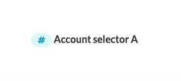
Account selector
- Account selectors should only be used where flexibility is required and accounts cannot be predicted 100% of the time. In this case, they should always have a default range selected which will solve 80% of cases so the template is automated for most clients.
- Where the flexibility of account selection is not required, the template should just be hard-coded based on (configurable) account numbers. We shouldn't need the account selectors at all (it just adds a manual element).
- Account selector sign should be on the left side.
Output
Attachments
- Attachments should be used when additional information/document is needed to supplement the existing information.
- Attachment sign should always be accompanied with the text or title. In this case it will be clear for the user to what part of the document the particular attachment relates to.
- Attachment sign should be on the right side of the text or title.
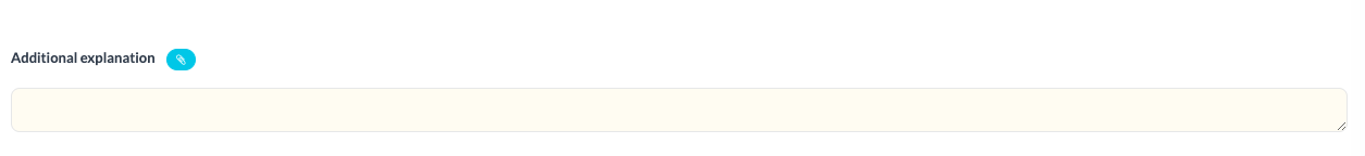
- In case there is only one input field for the comment, then the attachment sign should be placed next to the title of the section, as shown in the example below:
**Additional explanation** {% input custom.some.thing as:file %}
{% input custom.additional.explanation as:text placeholder:"" %}
Output
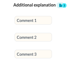
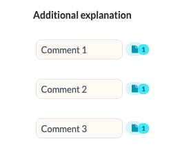
- In case you would like to add more than one comment (e.g. comments are in foriloop ), you can decide to display:
- a file button next to the title of the section that would contain all the attachments; or
- a file button next to the relevant field, to justify your comment.
**Additional explanation** {% input custom.some.thing as:file %}

{% fori item in custom.additional %}
  {% input item.explanation %}
{% endfori %}
Output
**Additional explanation**

{% fori item in custom.additional %}
  {% input item.explanation %}{% input item.file as:file %}
{% endfori %}
Output
Placeholders
A placeholder should be used as a hint for the user entering data in an input field. As mentioned above, an input field should always have a descriptive placeholder. This is crucial during the import of data.
.png")
TranslationNote: In case same template is translated into different languages, placeholders should be also translated.
Mandatory fields
- When you are obliged to provide certain information/value or when the field has to be completed, use mandatory fields.
- Mandatory fields should not be used with default values.
Updated 10 months ago
Did this page help you?