Banner
Banner is used to communicate important information that users needs to be aware before taking action or proceeding further.
Both in-page and in-line banners should span the full width of their respective sections to maintain visual consistency.
Contents
In-page banners
Purpose
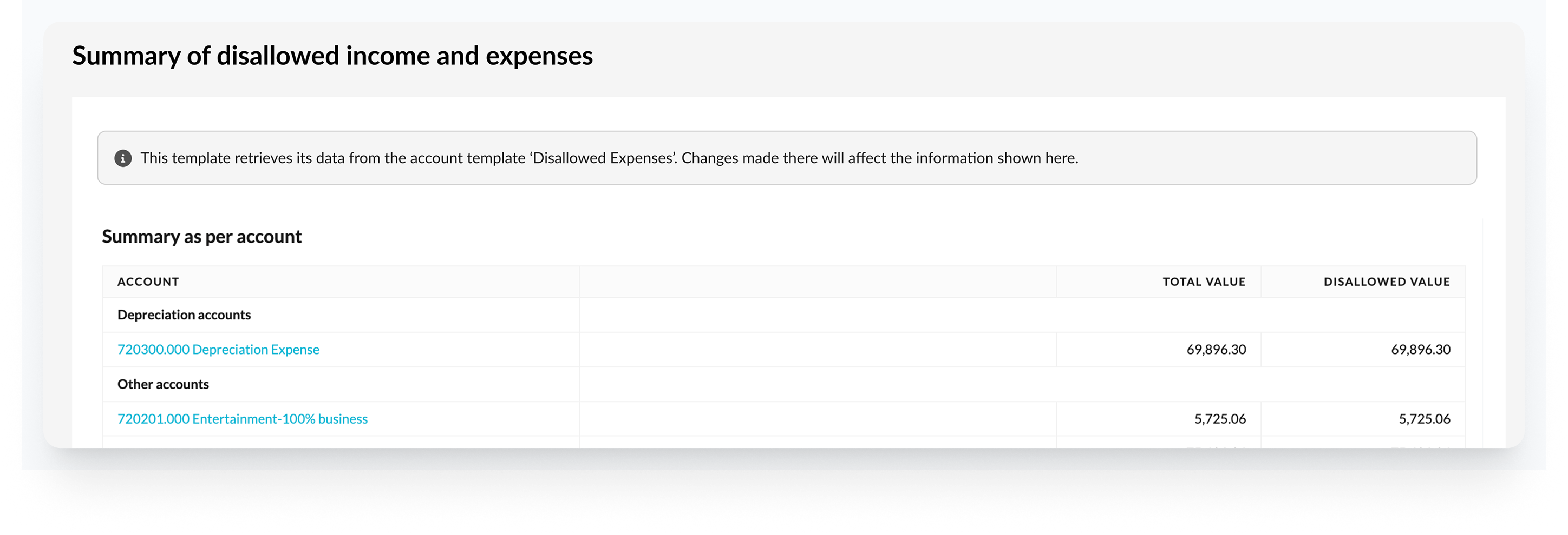
To provide important, contextual and relevant information that applies to the entire template or page.

When to use
✅ Apply to the whole page or entire workflow context
✅ Require high visibility but are not disruptive
✅ Provide system-level or template-level information
Placement
- Placed at the top of the page
Examples
- Important context that affects the whole template and needs to be visible immediately
- Guide users to take an action, such as filling out other template first
- Provide information about the source of data for the template
- Information about beta or test versions
In-line banners
Purpose
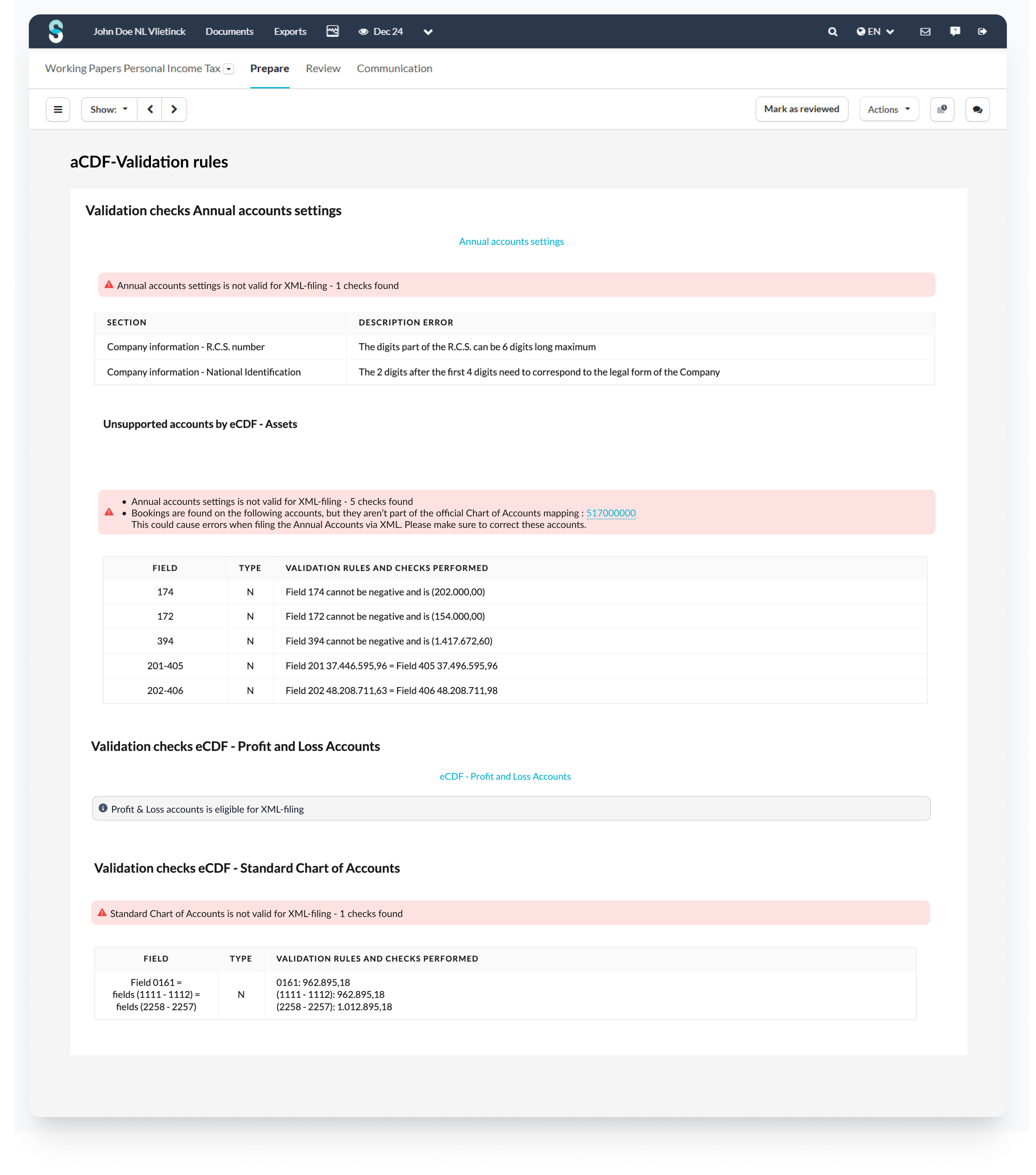
To provide important, contextual and relevant information that applies to a specific section or component

When to use
✅ Are specific to component, section, or input
✅ Provide contextual guidance or error handling
✅ Are triggered based on user interaction or state
Placement
- Ensure the banner appears in close proximity to the section or fields it relates to.
Examples
- Offer helpful tips or explanations to specific section in a template
- Provide feedback on certain section in a template (for example error found for certain section)
Best practices
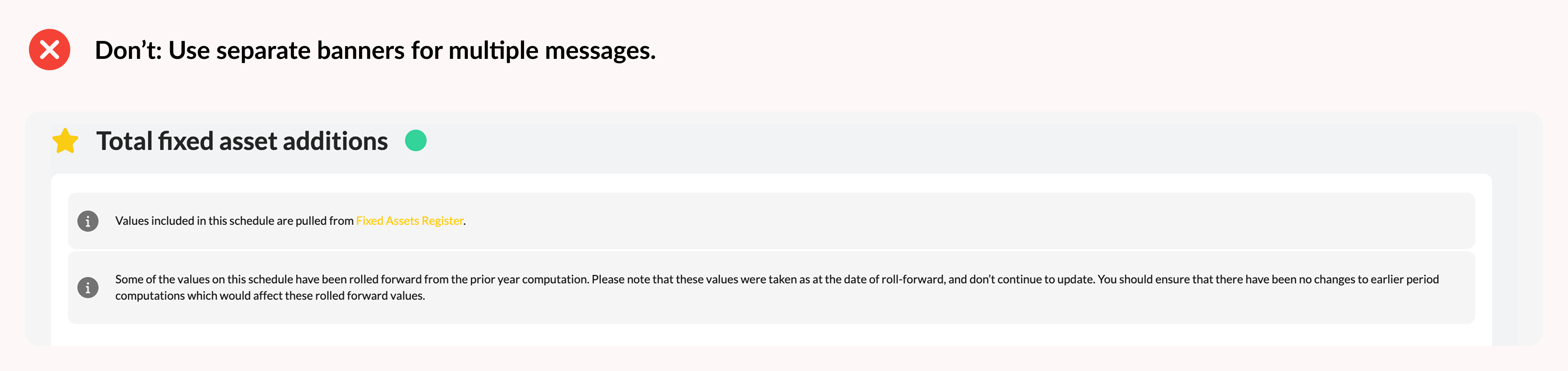
Avoid overcrowding
- Limit the number of banners to prevent visual clutter and user overwhelm
- Recommended: maximum two banners per page
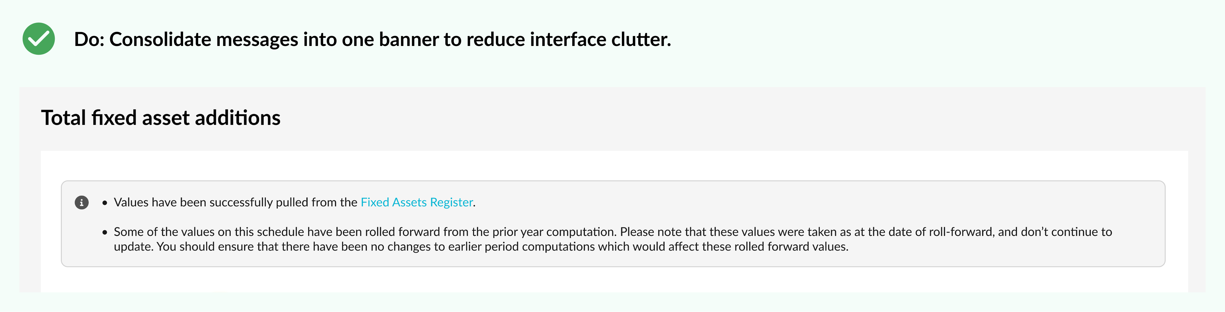
Combine related messages
- If possible, group multiple messages into one concise banner to reduce clutter
- Avoid repeating messages already addressed via input validation
- Format multiple pieces of information as bullet points to improve scan-ability
UX copy tips
- Keep messages short and focused on the key information
- Clearly tell users what they need to do next
- Use plain language that all users can understand
Example
Instead of a long, complex message:
“COMPLETE LIST with surname, first names, profession, place of residence (address, number, postal code and town) and position in the company”
Better UX banner copy:
“Please provide a complete list of employees including full name, profession, address, and position.”
Why it works
- Shorter and easier to scan
- Actionable – tells the user exactly what to provide
- Clear and unambiguous – avoids overloading with parentheses or extra details
Updated 7 months ago