🆕 Feedback system
What is the feedback system for?
It’s important that users have the information they need to complete their tasks. This information should be presented clearly and succinctly so that they can understand and act without friction.
Banners and indicators are designed to give you visual ways of providing key information to users.
They can be used to help users understand the status of their tasks and provide relevant and timely information needed to take their next steps or diagnose problems.
What has changed
On November 28, 2025, banners and icons were updated. Key changes include:
- Updated styling for banners and icons (excluding reconciled and unreconciled icons) to align with the Silverfin universal platform
- New yellow (caution) variant now available for both banners and icons
- Updated warning icon
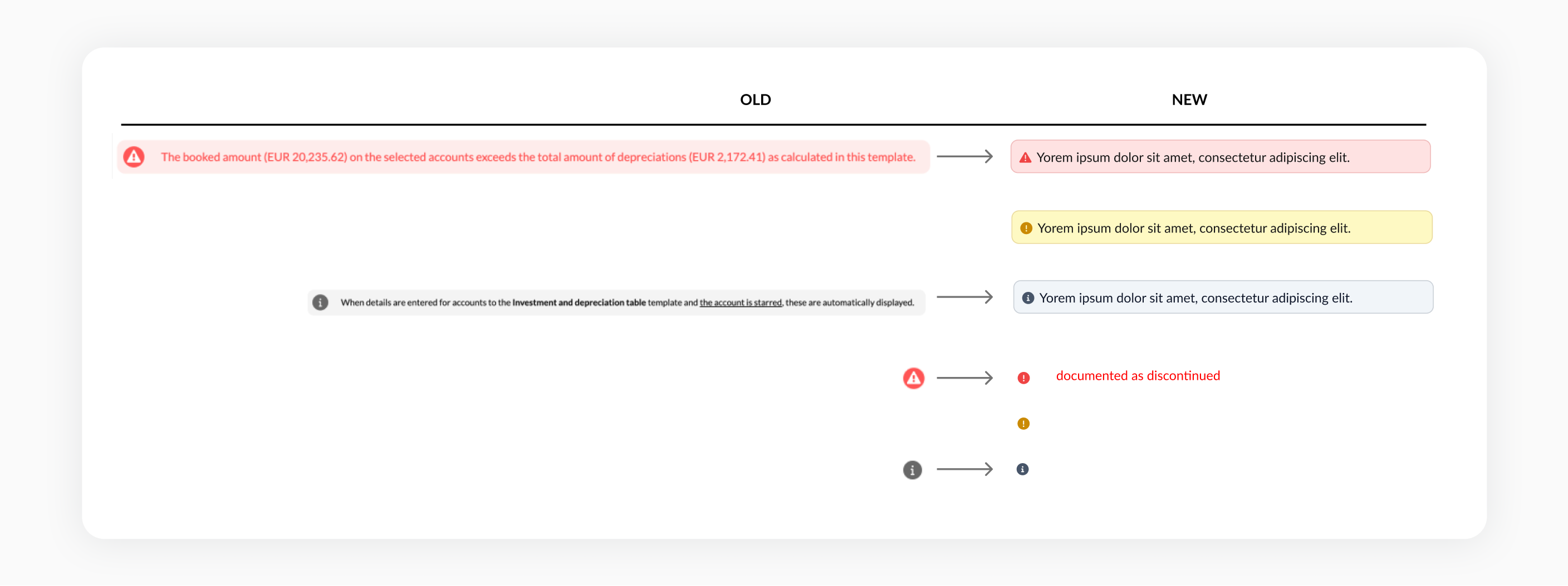
Comparison map showing the old components versus the updated components
During the transition, the old warning icon has been replaced with a new warning icon. However, the warning icon should no longer be used. Please follow the updated guidelines for the correct usage of the new icons and colors across all contexts.
Which component should you use and when?
In page banners
To provide important, contextual and relevant information that applies to the entire template or page.

In-line banners
To provide important, contextual and relevant information that applies to a specific section or field.

Typically, for both types of banners, the grey info banner will be the most common variant used in templates. All other variants should be used selectively in situations where it is deemed important enough that they need to read this information to take their next steps.
Reconciliation indicators
To indicate to users where something is directly impacting the reconciliation status of a template.
This is the most important and common status indicator for templates as it is helps users complete their primary tasks to reconcile their templates.
Icon indicators
Other indicators can be used to communicate the current status of a task or offer additional context, displayed directly alongside a specific field or element.
The grey info icon will be one of the most commonly used icons for providing additional information needed to complete templates. The yellow icon can be used to convey other types of status not covered by reconciliation status icons above and will be far more rare in usage.
What do the colours mean and when should you use them?
We use a ‘traffic light’ colour system to indicate levels of status or importance.
| Color | Meaning |
|---|---|
| Red | used to indicate a confirmed problem that requires user’s attention and should be addressed |
| Yellow | used to indicate a potential problem where there isn’t enough information to confirm the issue. Depending on the context, it might not require action. |
| Green | used to provide positive confirmation to the user that they have successfully completed their task |
| Grey | used for neutral or passive information |
How to avoid overwhelming users
When used selectively banners and indicators can enhance the user experience, helping users complete their tasks quicker.
However, overusing these components will overwhelm users with visual clutter and make it harder to complete their tasks. Each individual component is designed to be attention grabbing so using multiple components in the same space will slow users down and they won’t read or notice the information.
Updated 7 months ago